UASLP - AMT
Detalles
Angel
| Año | 2004 |
|---|---|
| Créditos | José Luis Coyotl |
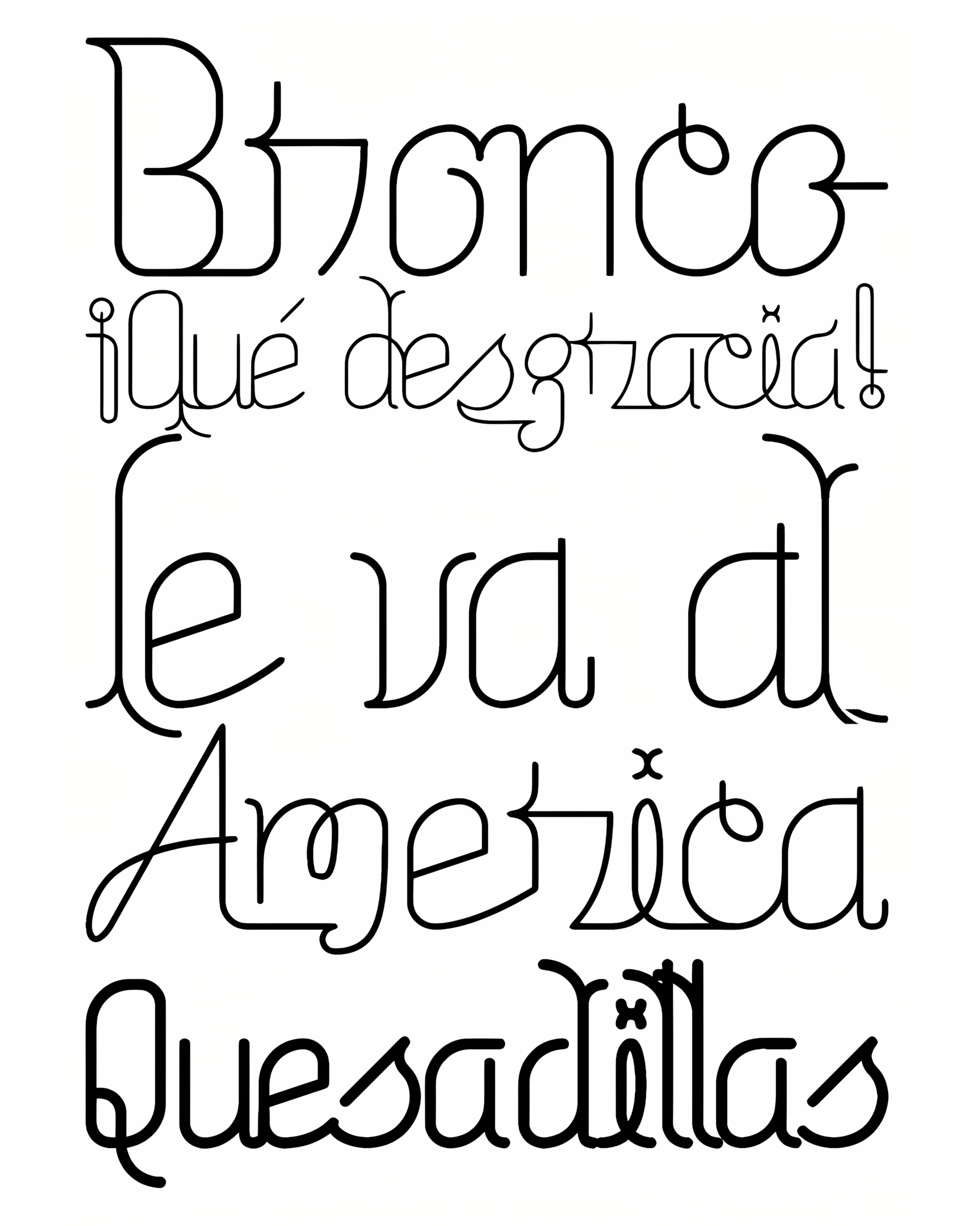
| Description | In 2004, I was invited for the mexican design magazine ENEO to be published with a review of my typographic work. They gave me the chance to write my own text and design the spread. So, I just wrote my text and I decide not just to design the pages that they gave me, also the body type of that. So, I just started to develop something intricate, complex, with the purpose to do a very unique body text, and the final result was a text with a lot of different letter from each other, one by one placed specially, just as the old printers of movable type, but in a digital way, with unique ligatures, a very visual words and with unique treatments. It takes a long time but I got something that I'm very proud to show. |
| Distribution | Acceso privado |
| Clase | custom |
| Clasificación | Títulos |
| Familia(s) | Normal, Alternate |
| Estilos | 2 |
| Glifos | menor que 256 |
| Set | Básico |
| Foundry | La Fe Ciega |