Bataclan Heavy
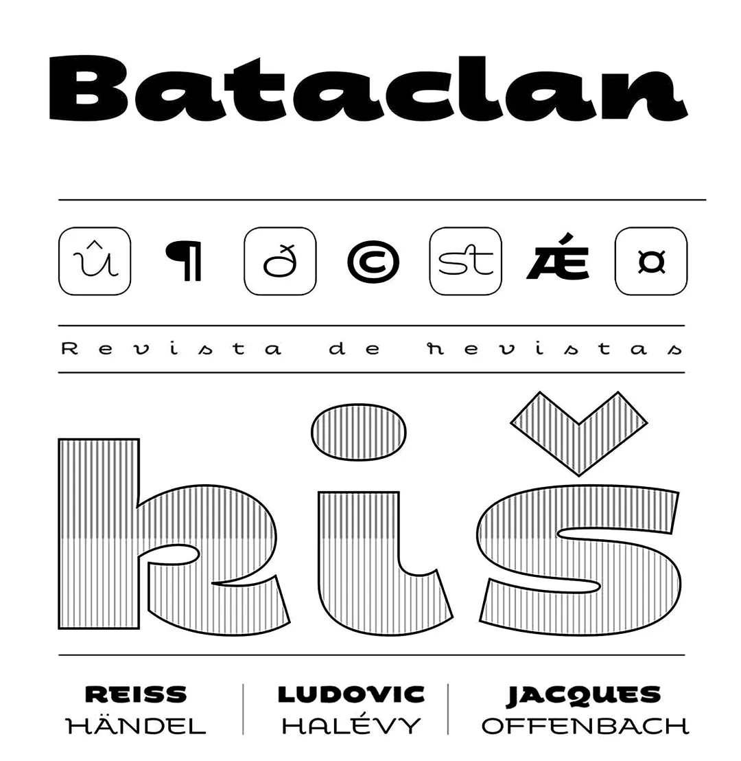
Fondue known as Bataclan before its commercial launch is a type family of eclectic shapes, inspired by Art Deco designs, in particular, the lettering used by the Mexican cartoonist Ernesto “El Chango” Cabral on almost the entire publication Revista de Revistas ("Magazine of Magazines"). Far from being a copy, Fondue expects to be an adaptation of the thinking of that time to be used in contemporary context.
Fondue has a cursive ductus, wide horizontal proportion and large x-height. Its friendly consistent rhythm makes it ideal for medium-sized text, headlines, branding, and so on.
The family comes in 6 weights, from Thin, which reminds of the cartoonist’s loose strokes, to Ultra Bold, the version with powerful and unique voice. Fondue has a set of 496 characters that support 207 different languages.. OpenType features include standard and discretionary ligatures as well as stylistic alternates.
CITA RECOMENDADA
TipoMap Latam. (2026). Bataclan Heavy. En Mapeo de la Producción Tipográfica en México (registro #1103). UASLP. https://doi.org/10.5281/zenodo.22709940 — Entrada consultada en https://datadesign.uaslp.mx/view_typo.php?id=1103